Before we get to this, ask yourself why do you need a website? Most probably, your answer will be to attract more and more customers. True. Today, the authenticity and seriousness of a business is highly influenced by the way it presents itself online. This being said, having your website on the world wide web becomes really important. But, just having a website is not where the story ends. You need to ensure that your website is a great website! One of the most important elements of making your website a great one revolves around user-experience.
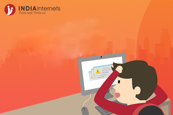
User experience is basically the way your website makes the visitor feel. Are the visitors usually happy visiting your site? Or does your website makes the visitor feel frustrated? If your visitors are usually frustrated, read through the following given reasons why:
1. Your website loads everlastingly
Today's users are impatient. This is because of the increase in mobile phones and easy access to the internet. The user does not want to wait any longer, not even for a little while. He/she needs the desired information as quickly as possible. This being said, if your website takes too long to load, the visitor will not feel any guilt in switching to some other related website instead. Remember, today, most of the visitors come to your website via mobile phones who sometimes rely on slower cellular internet connections while using the internet.
According to a report, 47% of consumers expect that a web page loads in less than 2 seconds, 40% leave the website if it takes more than 3 seconds to load. Even a one-second delay can reduce the customer's satisfaction by 16%
2. Your website is not mobile friendly
As stated above, today, most of the visitors browse the internet from the web. You must have experienced the annoyance when you use a mobile phone while browsing the internet and you have to scroll right to left for reading the content on a website, pinch-to-zoom because the words or the CTA buttons were too small. You would not want to annoy your visitors while they try to browse your website via mobile phones.
Besides, in summer 2015, Google announced a major mobile algorithm which penalizes the websites which are not mobile-friendly, and also, May 1, 2016, onwards, Google has started improving the ranking results of mobile-friendly websites.
I think these two facts are enough to make you understand why your website needs to be mobile-friendly.
3. Poor Navigation
Have you ever landed on a website and don't have a clue on what to do next? Ever felt like a website is too complicated to use?
If you have experienced this feeling, you wouldn't want your visitors to experience the same.
Make sure your website has a proper Call To Action executed so that the visitors know what you want from them. Provide people with direction on your website, a proper site map, headline copy, jargonless page copy which tells the value of your work, a primary Call To Action which shows the visitors the next steps - it can be to subscribe to your blog, a free trial, a share link, or anything which you hope your visitors will perform on your website.
4. Too many pop-up screens
Pop-ups are a good way for CTA purposes. However, if not used in moderation, it can disrupt the user-experience on your website. Pop-ups with an aggressive CTA can make the reader lose their interest and abandon your website altogether. Make sure you use Pop-ups smartly and in a limited way. You can use Slide-in CTAs using small banners which can slide in from any side of the website with a CTA expressed in simple words. This way the reading experience of the visitor will not be interrupted and your attempt at CTA will be more successful.
5. Multimedia content which autoplay
Imagine that you expected to silently browse through a website only to be bombed with a theme song/a video/a talking chatbot you didn't ask for. Adding to it the frustration of not finding the stop button. How much time will it take you to abandon the website?
Be courteous and seek permission before playing any sounds on your website. Remember, your website is for your customers and prospects to look at.
6. Fake or bad stock photos
Using images for your website is a great way of making your website look more professional and beautiful. While images help in clarifying things to a visitor, a bad stock photo tends to leave a bad impression on the visitors. Show real pictures of your customers, your employees, clients, products, and your location. Instead of showing a fake picture of For Eg. a group of models dressed in corporate formals, with happy faces, jumping up and down.
7. No extra contact form
Suppose you are on a website with only one contact number in the contact details. You try to call on that number but it does not connect. What will you do? It will take you not more than 2 minutes at the maximum to abandon the website. Or imagine you have to fill out a contact form and then wait for hours before receiving a call from the website's support... annoying, right?
Make sure to provide immediate support if you have a contact form on your website. Or, it is always better to have more than one ways of communication: at least 2 contact numbers, an email address, your social media links.
8. Too many keywords!
Keywords are important when it comes to SEO for a website. However, many a time, a website stuffs its content with too many keywords that the sentences stop making sense. You would not want that. Keywords are for crawlers, but the ultimate goal of your website is to attract more clients. Write a relevant and a readable content instead.
9. No share button
If you are a business, then you must understand the importance of blogs.
Imagine that you read a very relevant piece of information on a website that you want to share it with your contacts immediately! But, you do not find any sharing option. How disappointed will you be?
Always provide your readers with various social media sharing buttons for eg. LinkedIn, Facebook, Pinterest, Whatsapp, etc.
10. Poor execution of internal linking
Internal linking is a good way to direct your reader to another relevant piece of information and increase the overall user engagement with your website. However, there are only a few sites which are able to execute this properly.
Make sure to provide internal linking only to the relevant pages on your website which you think for sure will enhance the reader's experience. Be sure that the links open in a new tab window instead of the same tab in the browser because you wouldn't want to direct your readers to a new page while they were not finished reading the previous content.
Whatever happens, one thing that will never change is that your website is for your customers/users/prospects/clients to look at. Pro tip: Occasionally ask your visitors or employees to rank your website on a basis of certain criteria like user experience, content relevance, and loading time, etc. It will give you regular insights on what to change about your website in order to satisfy the visitors and bring in further traffic on your website.
Apart from the above-listed reasons, what are the other reasons that annoy you about a website?
Comment below and let the website owners know what they are doing wrong!
Author: Sakshi Srivastava

B-112, Sector 64,
Noida, 201301
+91 956 043 3318 (sales)
+91 999 950 8919 (HR)
sales@indiainternets.com